How can university course registration be improved?
Every term, college students are saddled with the daunting task of registering for the next semester. Outdated and unintuitive software tools make this task even more difficult.
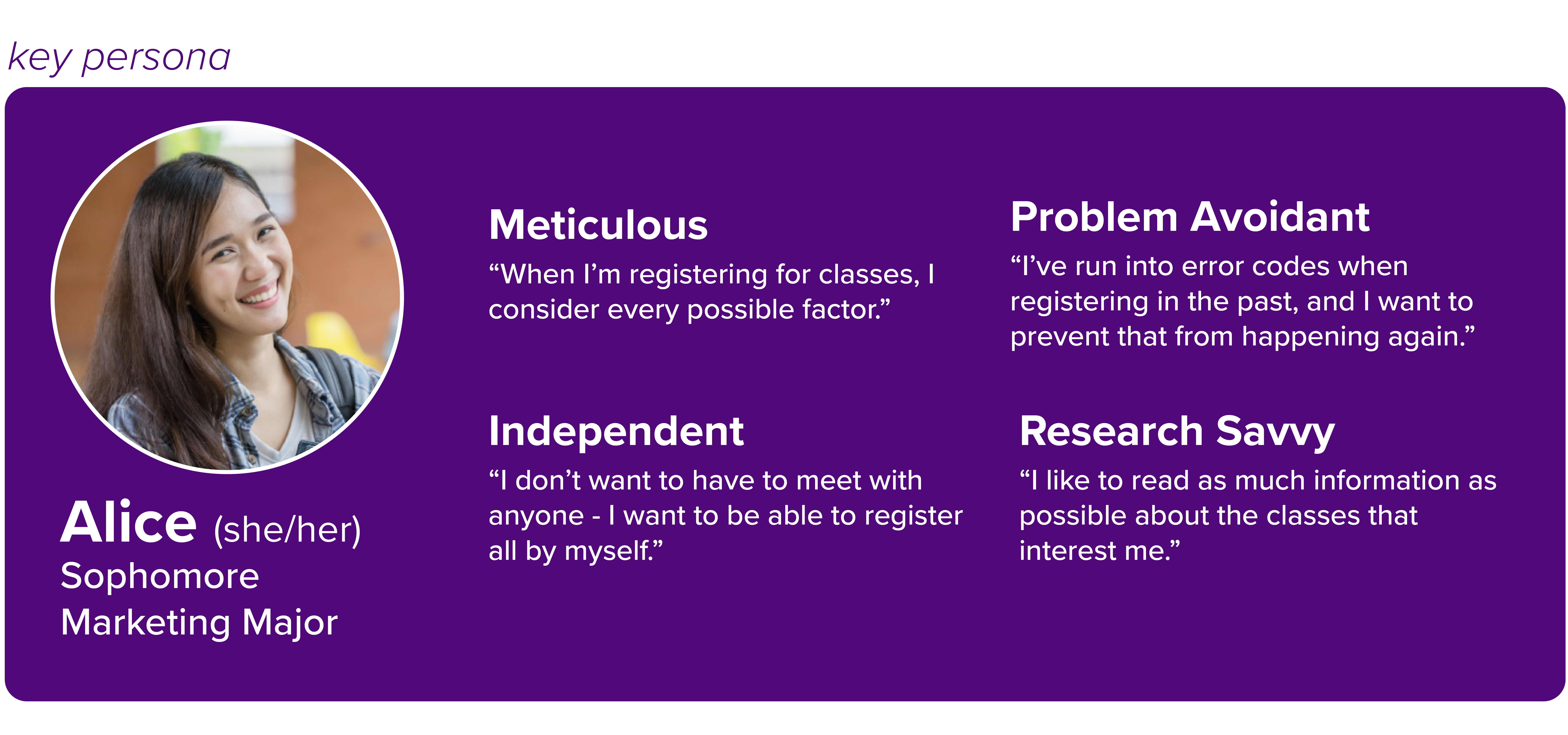
Over the course of a semester, two colleauges and I set out to diagnose the problems with our own university's course registration system and prototype a solution to present to the advising office and the office of the registrar.
Research and Modeling
In order to improve the old system, we have to know what about it works and what doesn't. The best way to do this is to interview its current users - students at UNI.
Information Architecture
We must consider what information and functionality users need to accomplish the most common tasks and bring that to the front.
Wireframing and Testing
After a functioning Figma prototype is developed, we have to test it with real users so we can make any neccessary changes.
Final Presentation
Selling this concept to university administrators requires convincing them not only that our new tool is better, but that the old one is actively detrimental.
01. Research and Modeling
After conducting and evaluating interviews with UNI students, we identified four primary pain points with the current course registration system. But don't take our word for it - hear it in the words of the users.
Information Overload
"There's so much stuff on MyUniverse, and I don't even use half of it! I don't know what some of it even is."
Academic Confusion
"It was hard to find the classes I needed to take for my major, what the class description was, or if I could even get into the class."
Difficult Navigation
"MyUniverse was a huge issue for me, because… I always needed to have two tabs open - one to look at my advisor report and the other to look at my shopping cart."
Emotional Burnout
"I just got really lost, and I ended up almost not wanting to register for classes for that following semester."
02. Information Architecture
Focusing on key touchpoints in the course registration process, we identified what information and functionality would be required for every step in the process and what information could be removed.
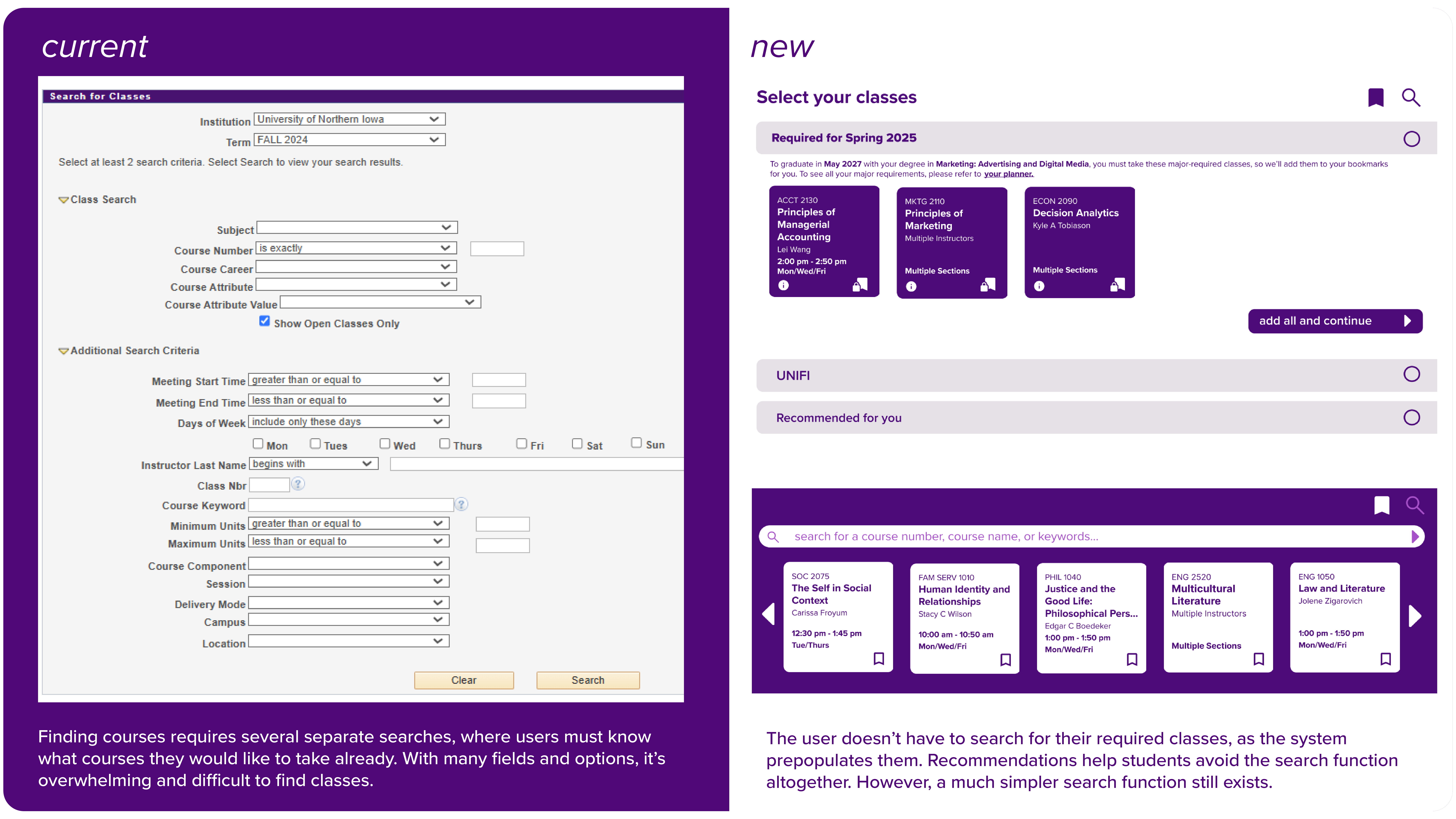
Finding Classes
-
Required courses for major(s), minor(s), and general education credits
-
Credits needed to complete graduation requirements in major/minor/general education
-
Recommended courses based on past course data from the user and other students
-
Prerequisite information - what courses is the user eligible to take?
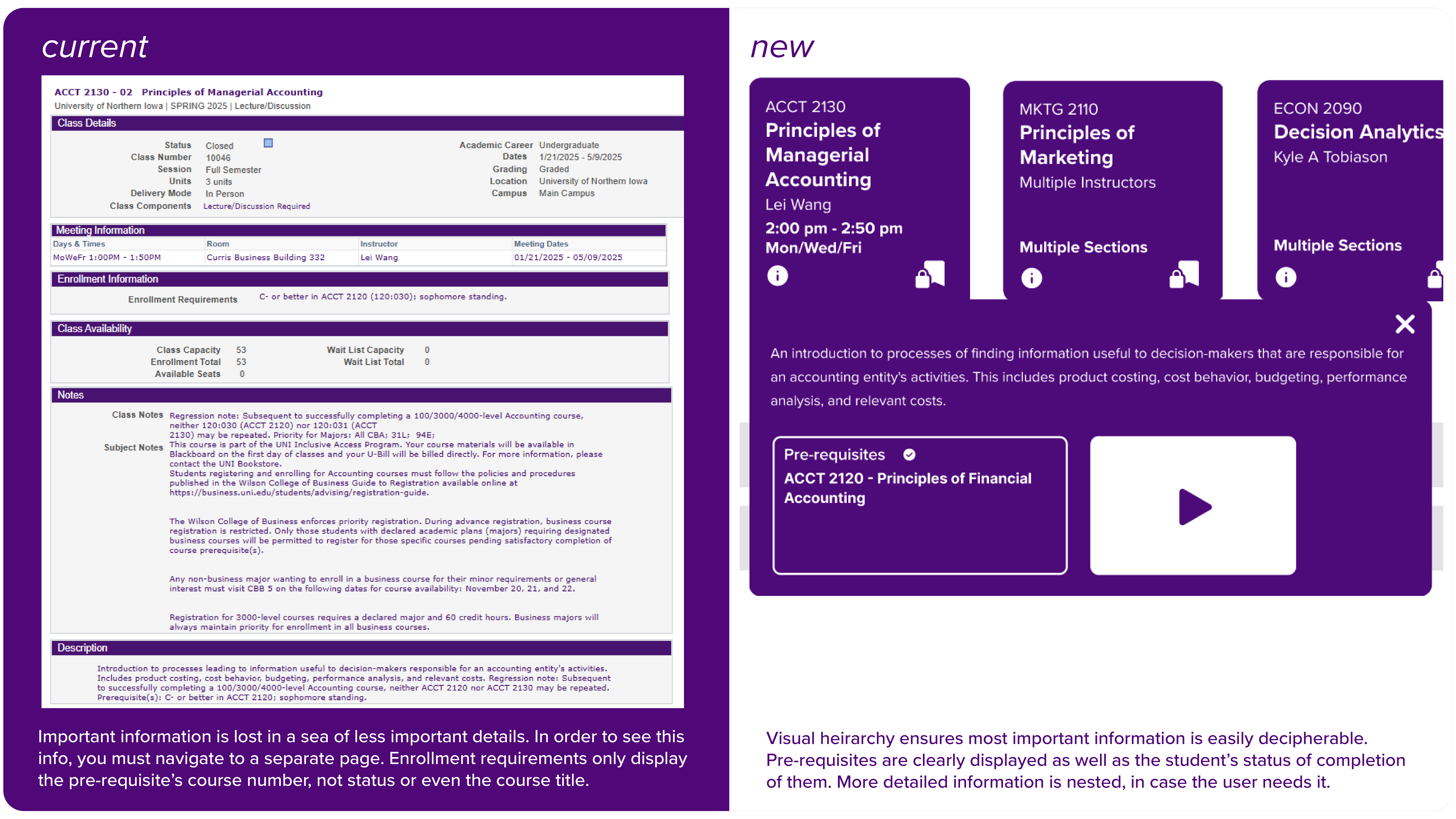
Viewing Course Information
-
Instructors(s), section(s), course name, and course number
-
Prerequisites and whether or not they are fulfilled
-
Rich descriptions and sample syllabuses that let students know what to expect from a class
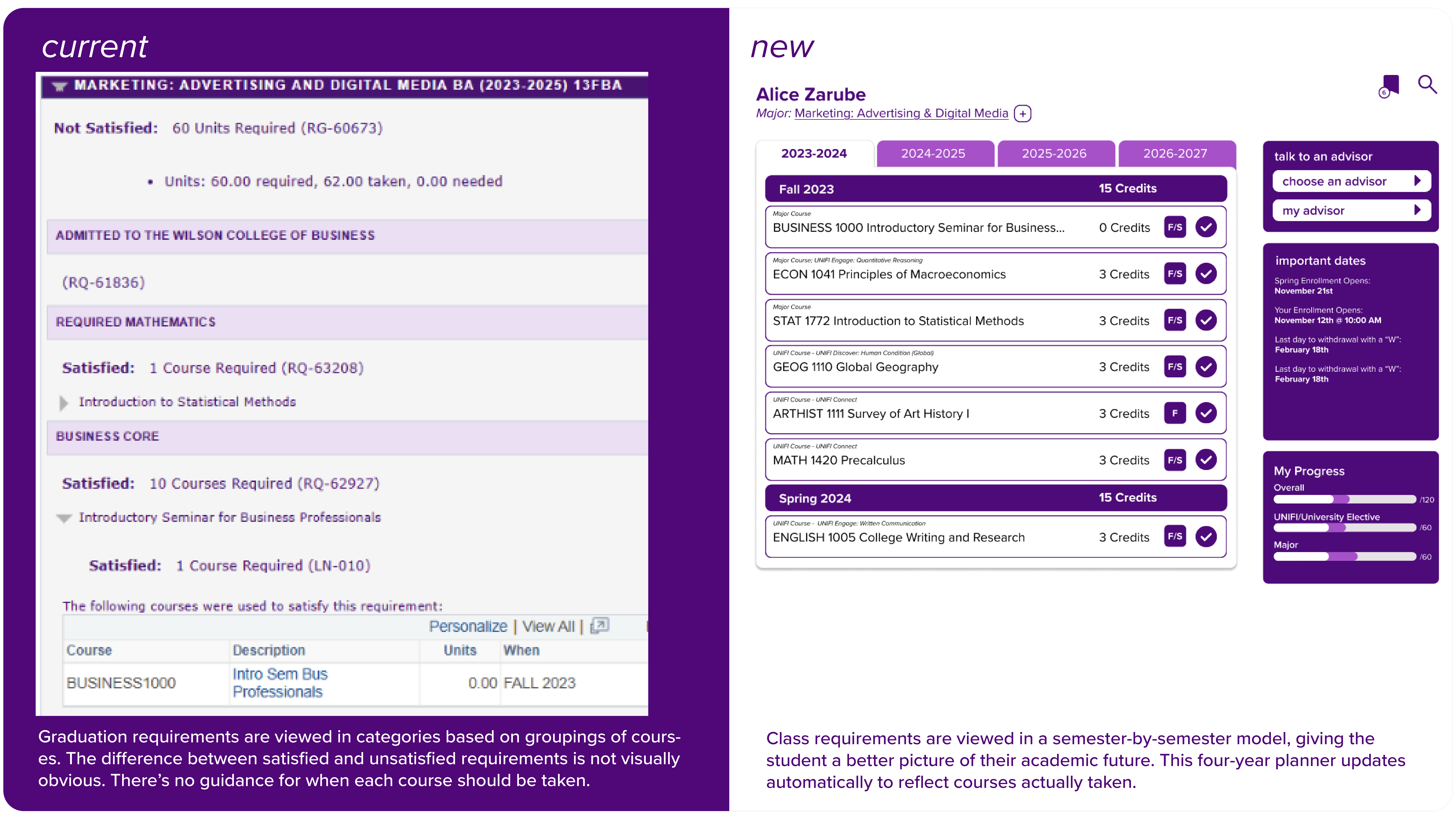
Monitoring Progress Towards Degree
-
Courses the student will be taking in the future, viewed by the semester in a 4-year plan format
-
Past courses the student has already taken
-
Four-year plan changes caused by changing degree programs or moving classes between semesters
-
Number of credits completed and number of credits left for major(s), minor(s), and general education.
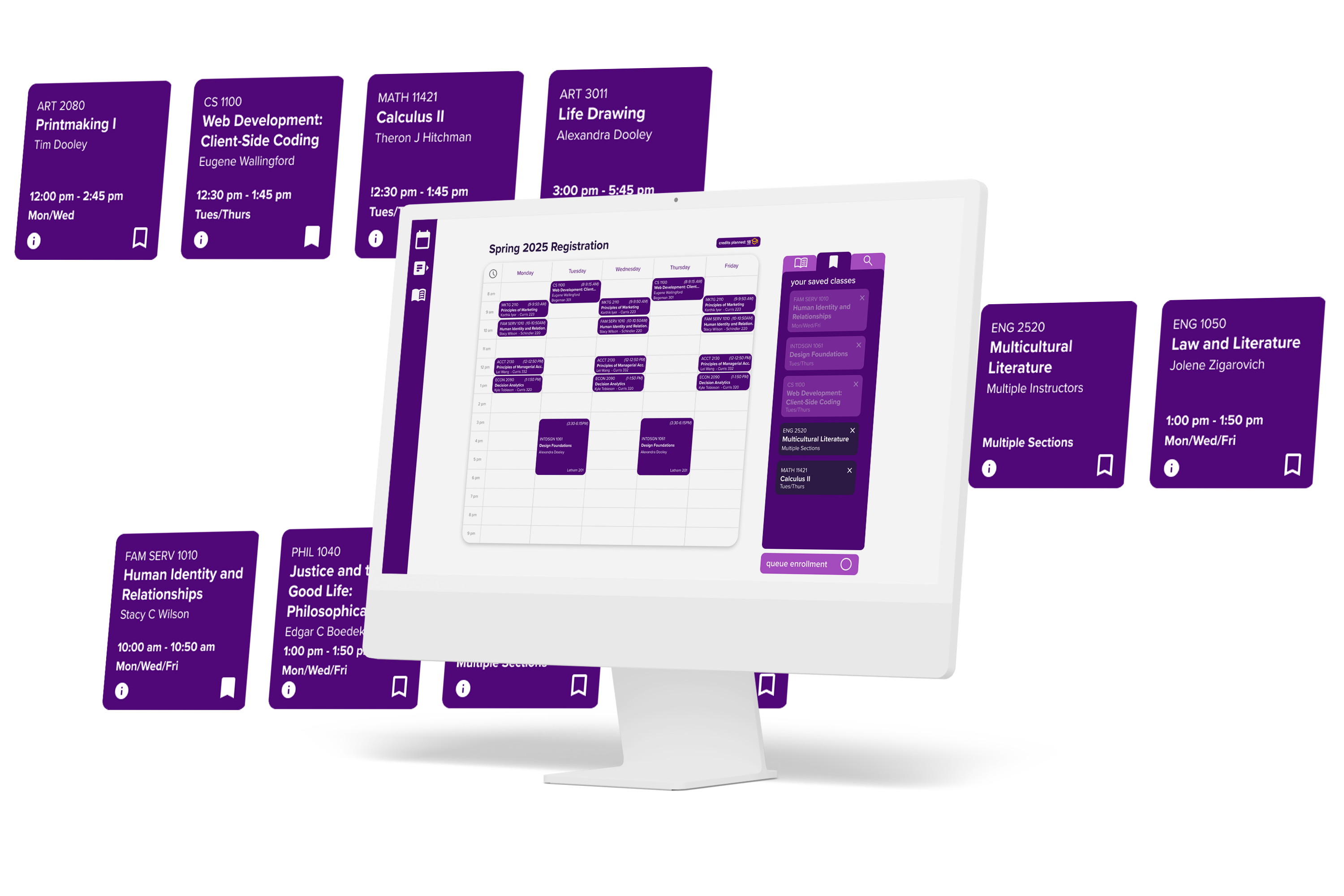
Building Class Schedule
-
Simple, weekly calendar view to help the student visualize their prospective course schedule
-
All possible sections for selected courses
-
View required courses alongside class schedule to make sure nothing is left out
-
Number of credits currently selected vs required for full-time enrollment
03. Wireframing and Testing
Once we knew what information is most important and when the user will need it, we started building a functioning prototype. Watch a video walkthrough of our final prototype!
To refine our prototype, we had to consider how we addressed the problems defined during our research stage.
Information Overload
The new system only shows users what they need to see for the current step in the process. Showing only the vital data and nesting more detailed information prevents overwhelming the user.
Academic Confusion
Restructuring the system to a step-by-step process that starts with ensuring the student gets into required classes prevents any errors that may delay graduation.
Difficult Navigation
By limiting the system to only three major screens and minimizing visible information, navigation is made much simpler.
Emotional Burnout
The new simple, quick registration process eliminates the possibility of critical errors while guiding and reassuring the user along the way.
04. Final Presentation
To sell our final prototype to university administration, we compared our new system to the old one.